Christine Show
Digital Design Projects
Redesign Project Manager - Client Side
As senior digital media officer at the Women’s Refugee Commission (WRC), I served as the project lead on the organization’s redesign of its entire website. I was tasked with launching the redesign, which consisted of a new menu navigation and a restructuring of how WRC showcased its programs and research.
I served as the project manager for the redesign of this launch. In my role:
- I directed the external web design firm on executing the launch of the redesign.
- I facilitated all approvals from multiple internal stakeholders, including our entire executive team.
- I planned and wrote search engine optimization (SEO) titles and descriptions on every page of the website, which did not previously exist.
- I reviewed more than 1,000 documents to ensure they were properly categorized on the website’s new research library.
Original design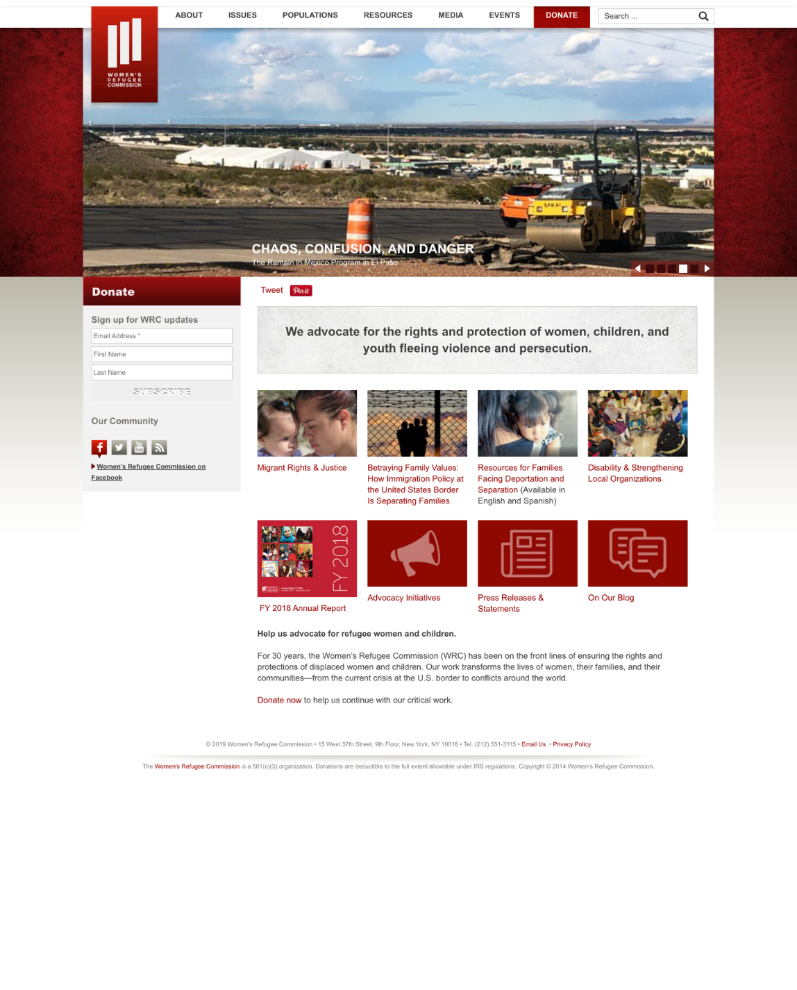
My redesign project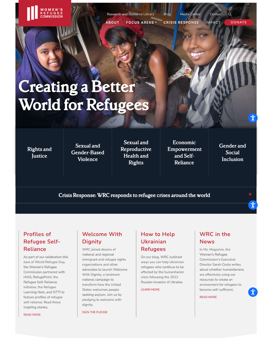
Digital Project Manager
As the Women’s Refugee Commission (WRC) built a stronger organizational advocacy approach that utilized digital tools, there was a need to create pages that featured our work on particular refugee crises happening around the world. These pages didn’t have a central home and were technically orphan pages. I wanted to create a hub for this work so any time a crisis struck around the world we had a place where we could share resources that were easily accessible on our website.
I strategized with WRC’s website design firm to establish a crisis response section, which is featured prominently on the organization’s home page. In this role:
- I led the creative vision behind the crisis response section, including overseeing all written content, imagery, and UX/UI design.
- I directed the website design firm tasked with establishing the new section as well as all internal stakeholders. This included content writers, manager approvals, and leading design reviews of wireframes.
- I developed a promotion strategy for the section, including developing Google Ads around the section and creating social media ads on Facebook, Instagram, and Messenger. These efforts have resulted in the section comprising more than 12% of all pageviews on the website in its first six months of launching.
Original design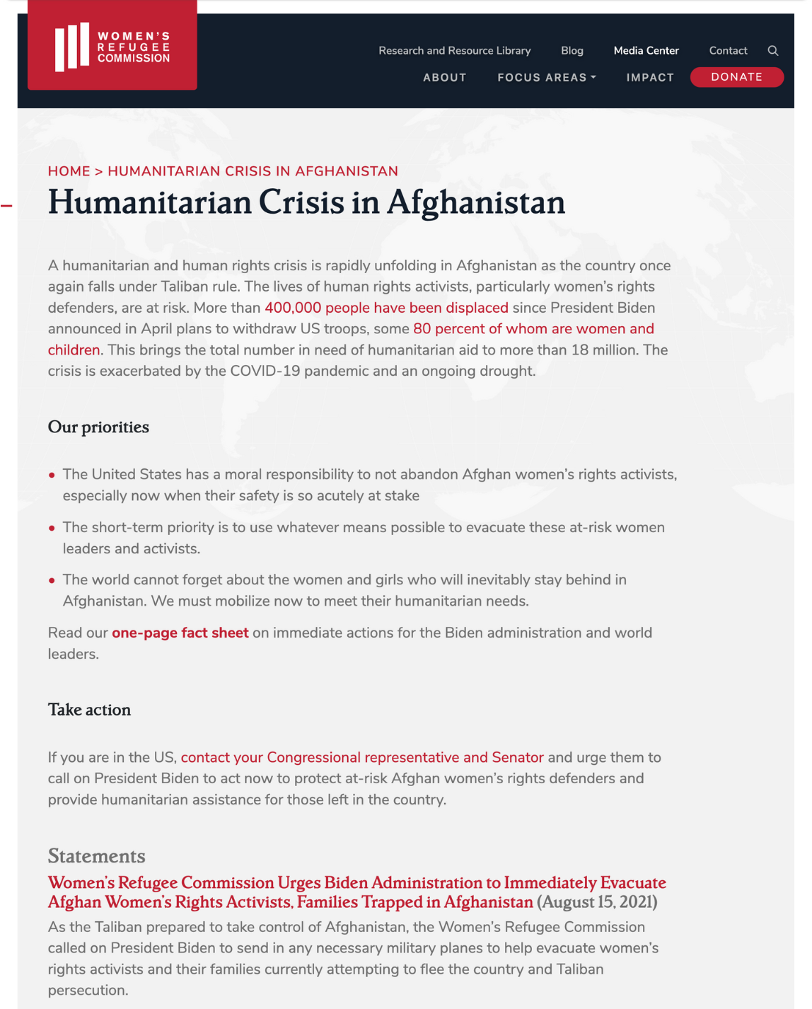
My redesign project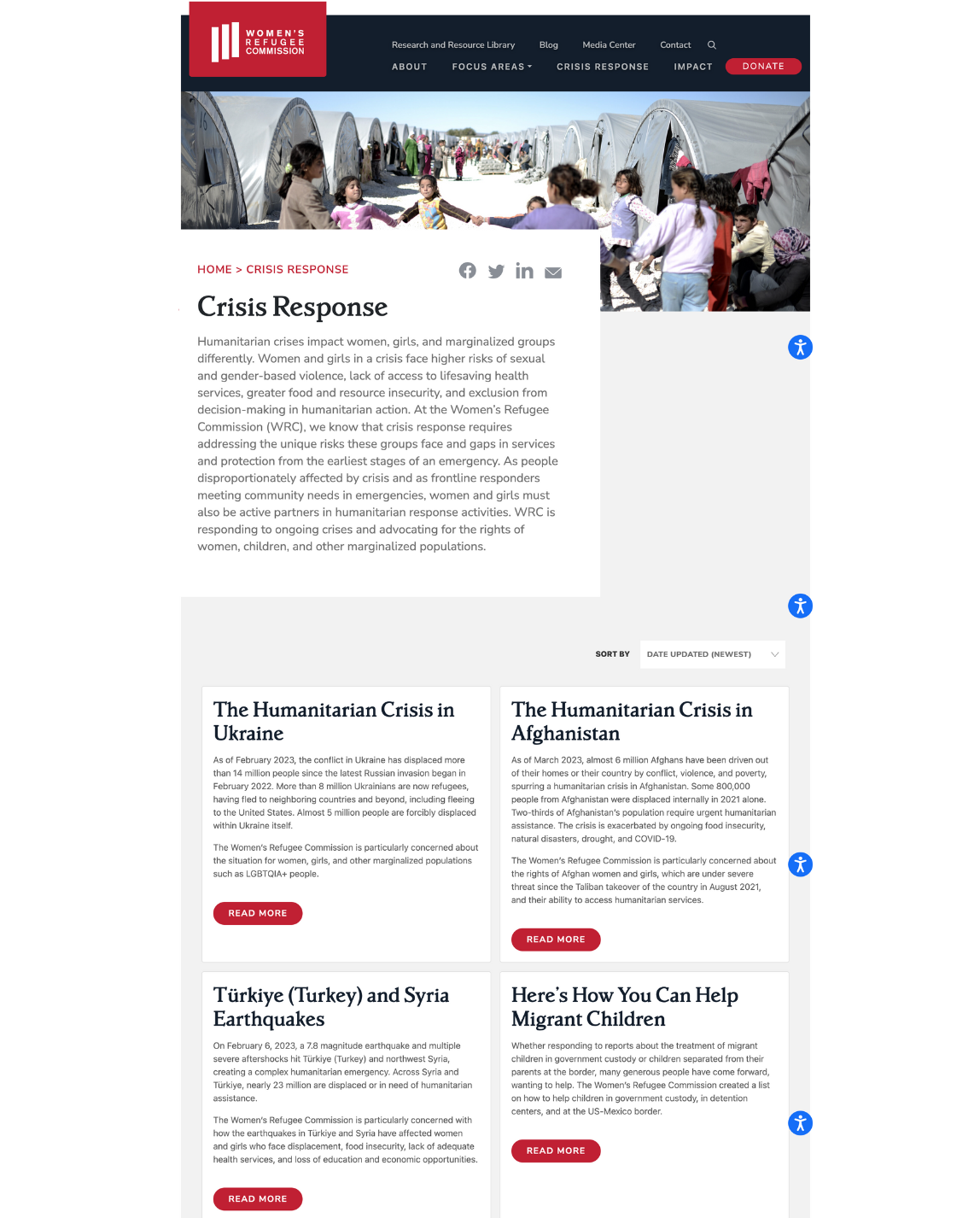
Redesign project manager
When I became the website editor at Columbia Law School, the site had a faculty section with profiles for each professor. Each profile page consisted of one long block of text without any particular format to organize the content.
I served as the project manager for the redesign of this section. In my role:
- I led a team of 17, including staff, leadership and external vendors, to execute the design decisions and get approvals.
- I set a firm deadline with milestones for the team, ensuring all tasks were completed on time and within budget.
- I reviewed the existing content of the 465 profiles and identified common themes throughout the profiles to structure the new design.
- I developed editorial and visual style guidelines, revised all profiles to fit the new responsive structure and created a photography plan for faculty headshot styles.
- I hired external vendors to join internal staff to rewrite all profiles.
- I edited every one of the 465 profiles for style, spelling, punctuation and accuracy.
Original design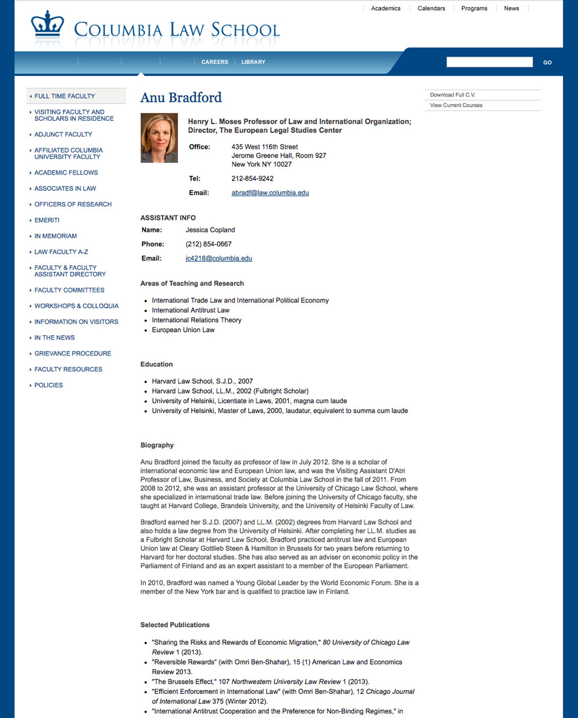
My redesign project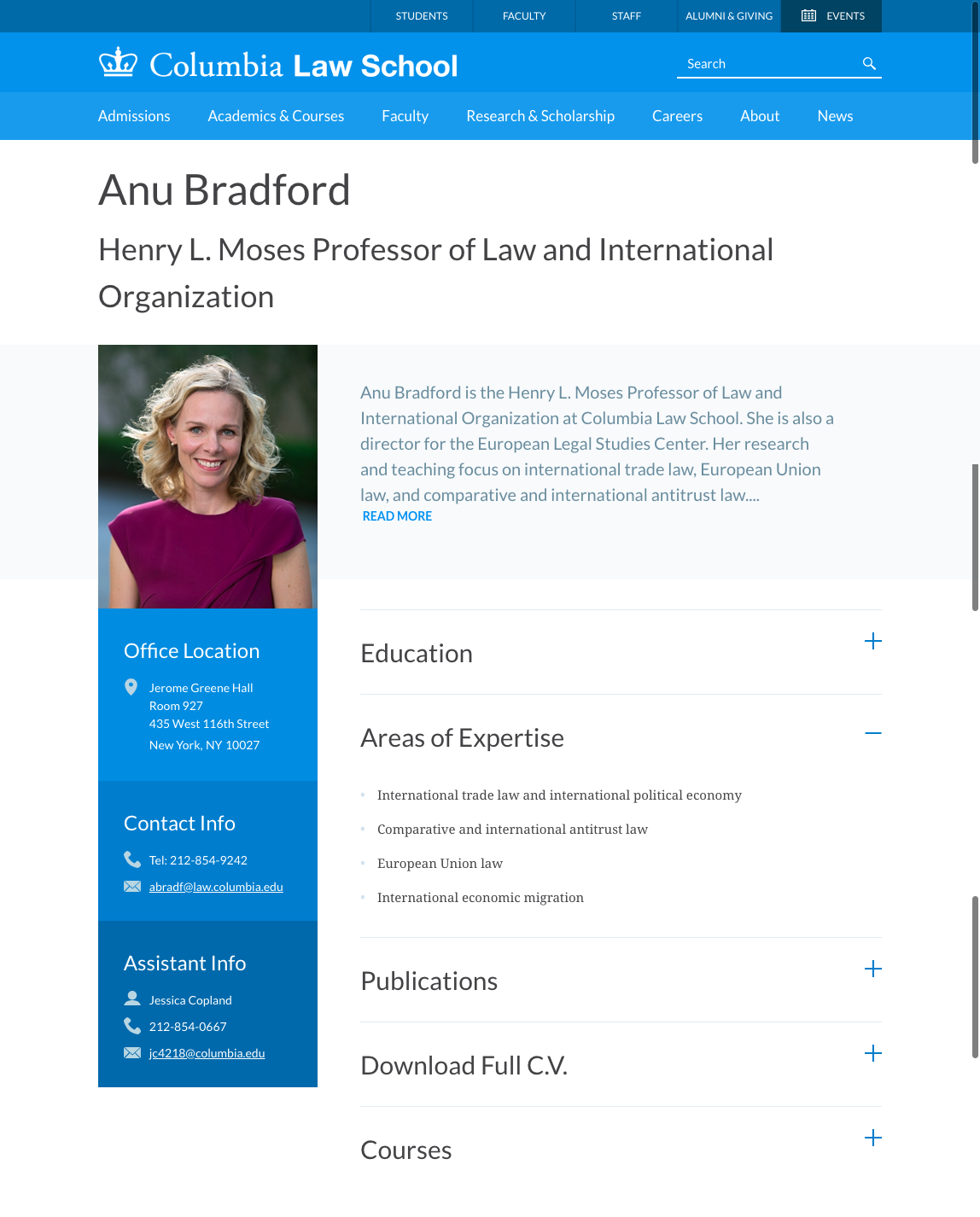
Recoloring project manager
I served as project manager of a global recoloring plan for the Joyful Heart Foundation’s website. In my role:
- I completed the project in six weeks, ahead of the eight-week deadline and within my first 90 days after joining the organization.
- I set a firm deadline with milestones for the team, ensuring all tasks were completed on time and within budget.
- I directed a team of external web developers on the design and placement of colors that reflect Joyful Heart’s branding guidelines.
- I reviewed the more than 500 pages on the website to ensure all headers, backgrounds and link hover states were in the correct colors and not missed in the code changes.
Original design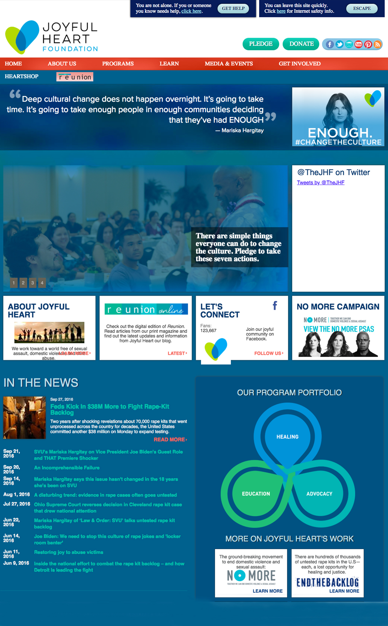
My redesign project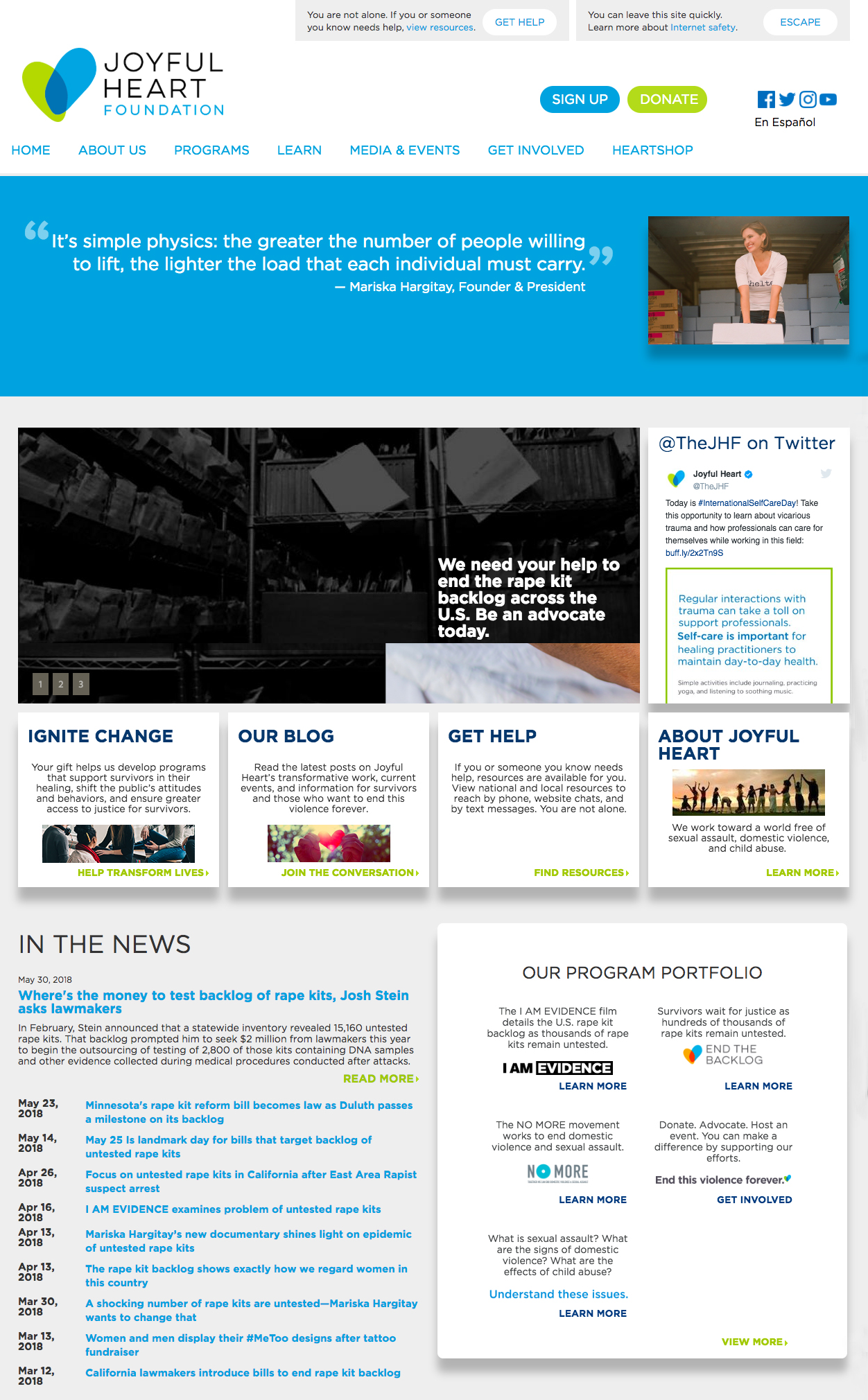
Digital content redesign planning
I served on a team to redesign the home page of the Columbia Law School website. In my role:
- I researched the website’s traffic on Google Analytics, generating reports on the highest pageviews, as well as search terms visitors were using to find the website on search engines. Our team used this information to determine what information was most relevant to put on the home page.
- I established the hierarchy for the landing page’s content to best position responsive elements for desktop and mobile devices.
- I interviewed deans and other leaders in the school’s admissions department to understand what prospective students were most interested in when speaking with staff. This information was used to determine placement of the most popular content found in Google Analytics.
- I collected evergreen resources, such as photos and student quotes, to put on the page for static content.
Original design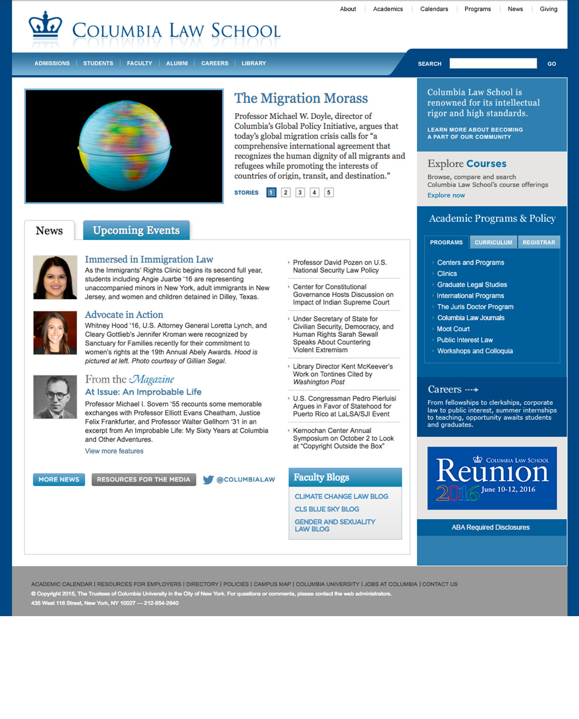
My redesign project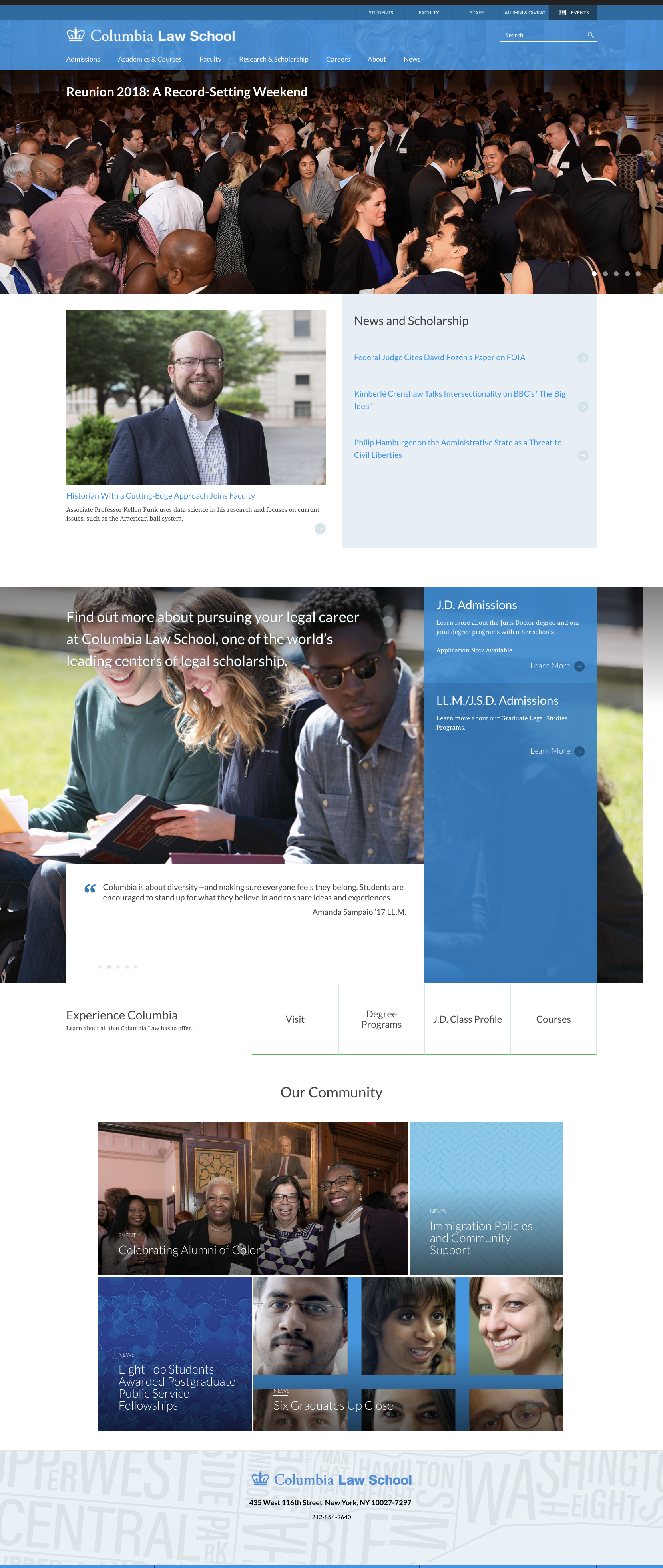
User-friendly content design
As the Joyful Heart Foundation’s digital platforms manager, I researched traffic on its website through the organization’s Google Analytics account. The most visited section of the website focused on information and resources for survivors of sexual assault, domestic violence and child abuse. The section, however, had outdated statistics and the content included long blocks of text without any visuals.
I pitched and completed a redesign project of this section:
- I researched statistics and relevant information to update the website pages with current facts, figures and helpful details.
- I rewrote the copy on all of the section’s 20+ pages, condensing the copy in a more web-friendly way using bullet points and short, straightforward sentences.
- I created visuals using icons to represent statistics and developed a pamphlet with key information for distribution.
Original design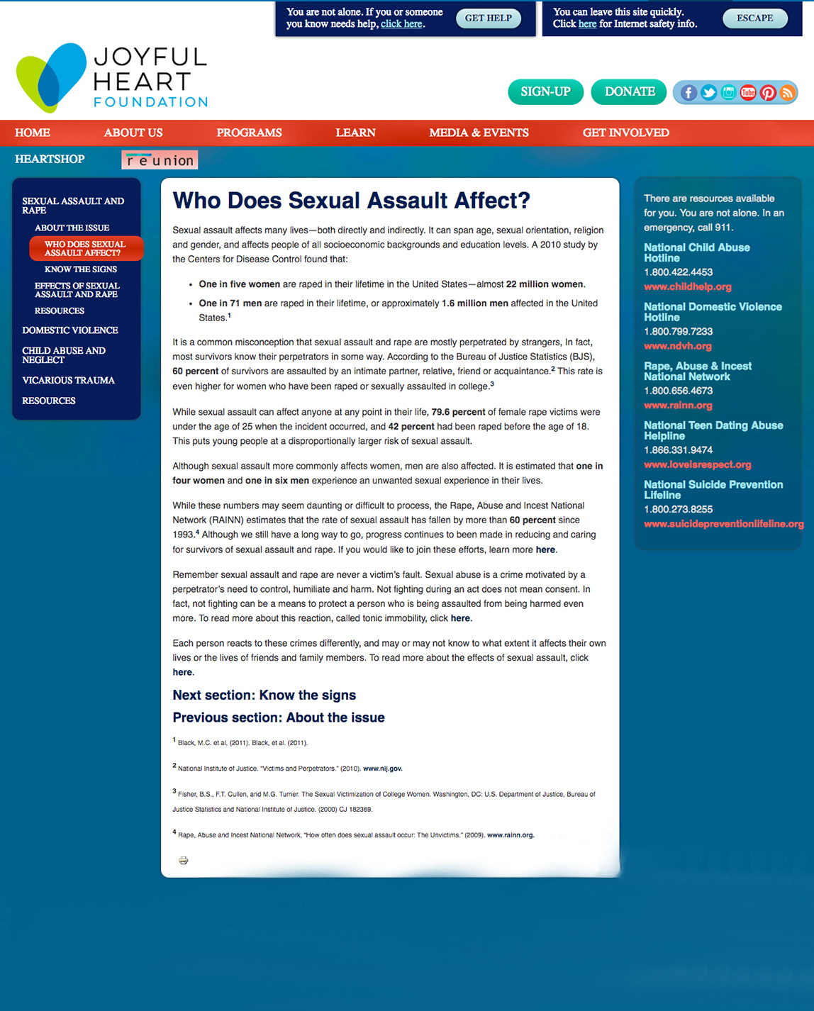
My redesign project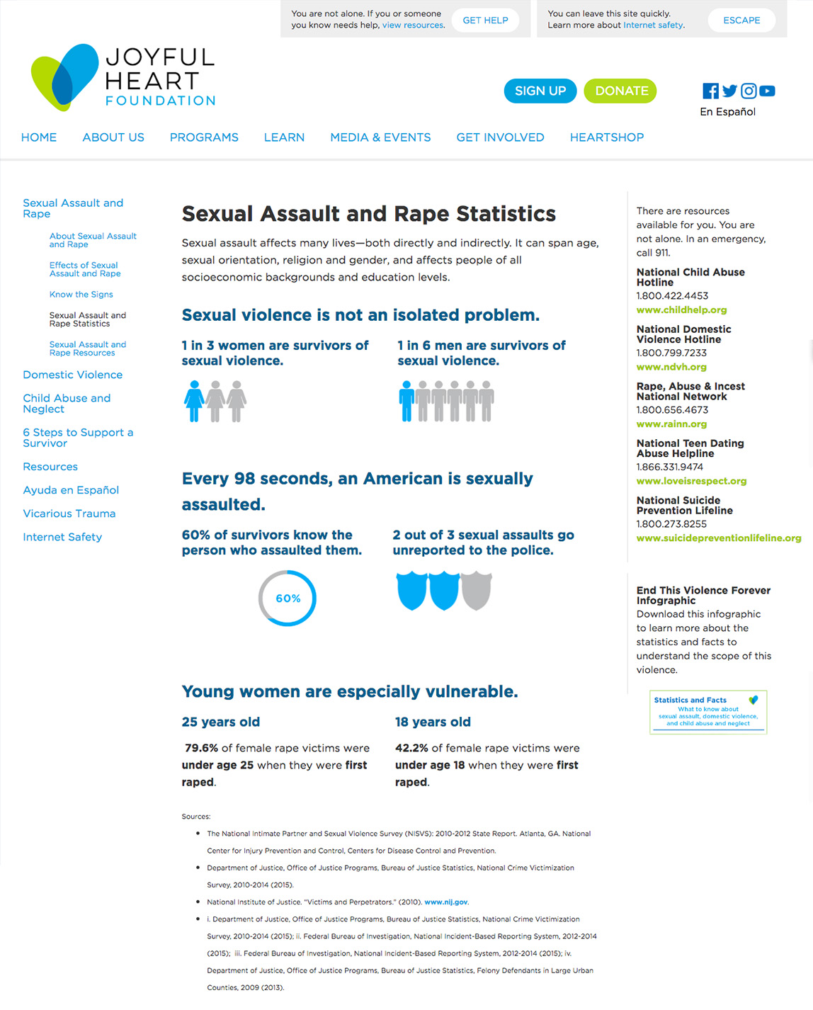
Email marketing for desktop and mobile applications
When people sign up to join the Joyful Heart Foundation’s email list, they receive an email confirmation thanking them for signing up. I pitched and completed a redesign of this email. The original one had no visuals and no design components. It was one long block of plain text on a white background. I researched and found that welcome emails are critical for nonprofits to connect new supporters to the organization. For this project:
- I created the email in a responsive layout using HTML and CSS I custom built within the email platform, Blue State Digital.
- I edited a photo representing joy and community as the first visual a new subscriber sees when opening the email.
- I wrote the copy in a tone of gratitude and excitement. The copy is short to catch people’s attention so they can easily skim through the body of the email.
- I decided not to bombard the subscriber with too much information in an email. I listed the mission, thanked the subscriber for signing up and then added a link inviting the subscriber to read about the organization’s background to move the engagement forward.
Original design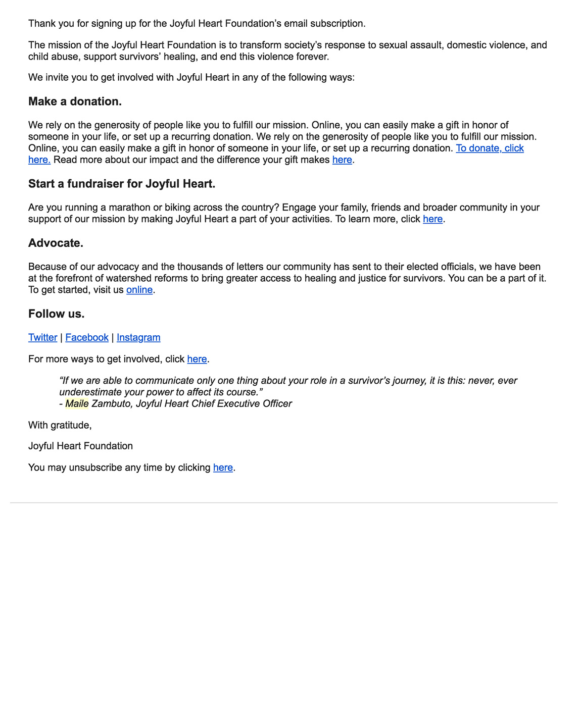
My redesign project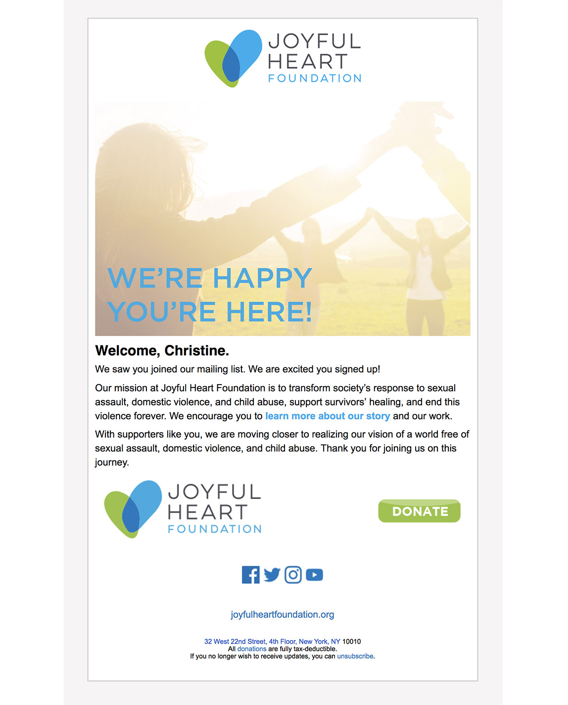
Español
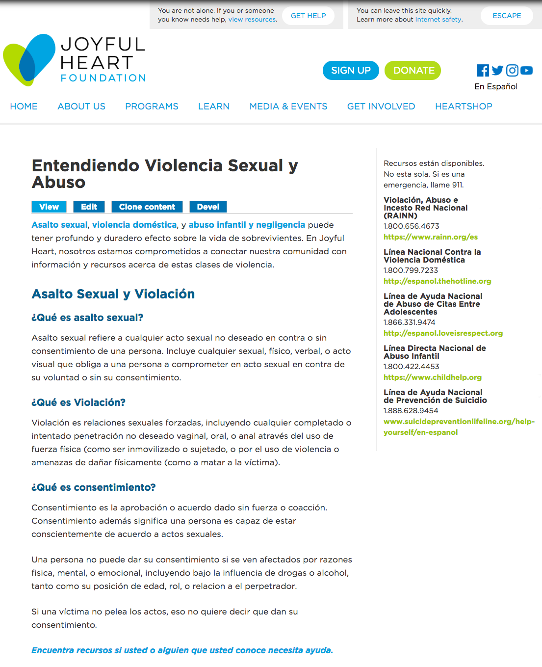
As the Joyful Heart Foundation has worked with related organizations on issues of sexual violence, I noticed that many of these organizations’ websites had a Spanish-language section to provide the same resources to survivors who speak Spanish. For this project:
- I reorganized existing English copy and wrote new copy to prepare for translation.
- I worked with one of my family members who volunteered to help me write the translations.
- I designed the pages, including collecting a list of Spanish-language resources with directions on how to reach a Spanish-speaking advocate when calling an English-first hotline.
Interactive Quiz
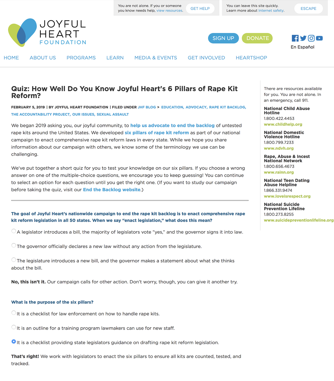
The Joyful Heart Foundation has a legislative campaign to enact comprehensive rape kit reform legislation in all 50 states. While Joyful Heart encourages everyday people to become advocates to urge lawmakers to pass six pillars of reform, the terminology is very policy-focused. I thought an interactive quiz would be a fun way to showcase our talking points in the form of a “test” for our blog visitors and social media followers so it could be more digestible and user-friendly to read. (Take the quiz!) For this project:
- I wrote all of the code, adding radio buttons people would click on to find out if they had the correct answer. A response with the right or wrong answer would appear. They could continue to try again until they got the right answer.
- I wrote all of the questions, answers and intro copy. I considered the information Joyful Heart wants to highlight about the pillars, the questions I or our followers have had about the pillars and different ways I could arrange a question when building the quiz.
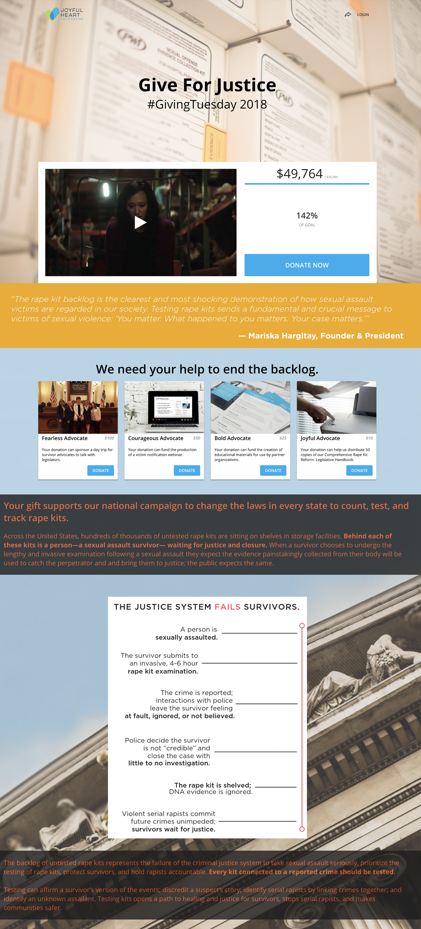
#GivingTuesday 2018 donation platform design
The Tuesday after Thanksgiving is an international day of giving, which the Joyful Heart Foundation observed by launching a fundraising campaign on a new donation platform. I was tasked with designing the campaign (view in full). For this project:
- I defined the focus of the campaign to be to count, test and track rape kits. With this focus, I set up the content to clearly show what the problem was and what Joyful Heart was doing to fix it.
- I hand-coded sections of the content using HTML and CSS, including brand colors and fonts.